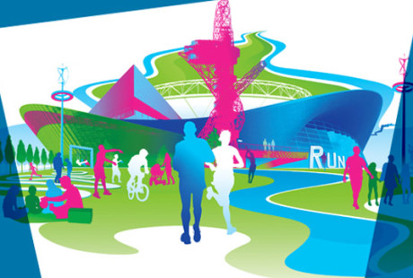
 For quite some time now I’ve been noticing the increased use of the color pink in graphic design, home decor, and clothing.
I am fond of the color pink, but have been hesitant to use too much pink in my graphic design or my artwork for fear that it would have limited appeal.
Since the 1980’s, prevalent advertising trends have drawn girls to pink and boys to blue. At birth, most children prefer blue and primary colors. By age three, social pressure and current advertising trends influence them to associate pink with girls and blue with boys.
Pink has been popping up everywhere. T-Mobile has a pink logo and the London Olympics logo included pink. According to PantoneView, “when brand consultancy Wolff Olins first unveiled the logo for the 2012 London Olympics, the reception was mixed – not least because of the prominent use of pink.” Recently opened Queen Elizabeth Olympics Park includes the Olympics Stadium and employs the olympic color palette, which includes pink.
During online searches of major men’s clothing brands, I noticed an uptick over the last few years in pink clothing for men, ranging from soft peach to bright magenta.
The only pink logo that I have designed to date, is for Wayside House, a women’s recovery center. Will I have an opportunity to design a gender neutral logo that includes pink anytime soon? Do you think that pink and blue will ever become gender neutral colors?

T-Mobile logo


It’s not surprising, since Radiant Orchid has been chosen by Pantone as color of the year 2014