I was thrilled recently when Anna Lee Sanders and her mother, Susan Santisi, expressed interest in having me create some promotional materials for their business, Pilates and Yoga of the Palm Beaches. I’ve mentioned the battle to keep my back healthy in the July 31, 2012 post, Standing While Working. Anna, my pilates/yoga instructor, was instrumental in helping me resume my active lifestyle.
To help me better understand the project, we reviewed their existing business cards, flyers, and the website. I suggested that to begin, I design a branded look for Pilates and Yoga of the Palm Beaches.
Initial concept for Pilates and Yoga of the Palm Beaches logo
Typography
Enthusiastically, I went to work trying to create a simple text based design that would serve as a logotype. I came up with way too many workable concepts. From those Susan and Anna selected an arrangement of modified text that was based on the font, Voltagio. I chose to work with this font because it was clean, easy-to-read, and contemporary looking. Some of the gentle curves on the vertical elements brought to mind pilates and yoga postures. I did not like the upper case “Y” in “yoga.” While the rest of the lettering had a graceful quality . . . the “Y” looked stiff and awkward. I wanted a “Y” that was performing a sun salutation, arms outstretched. I reconfigured the “Y” to be more graceful and placed the ampersand in the circle. It is more playful and more memorable. We chose to simplify the design by eliminating “of the” and the “es” in “Palm Beaches.”
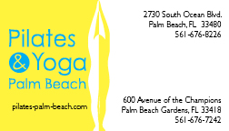
brand image for Pilates and Yoga of the Palm Beaches
Color
I worked diligently on color combinations and applied them to business card design concepts. The color options looked OK but none had the desired “WOW” factor. After nearly a full week of driving rains from Hurricane Isaac, the sun shone into my studio window and provided necessary inspiration…Eureka! I created the sunshine and blue sky combination pictured at left. Anna and Susan loved it. A branded look was born.
We’ll be moving forward with business cards, a brochure and a website. Stay tuned.
Pin It
Recent Comments