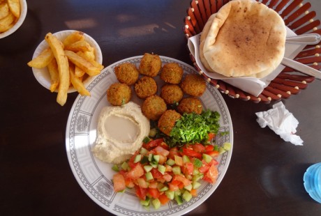
I just returned to the U.S. from a trip to Israel. This morning I was thinking about how much I miss my favorite falafel stand. The falafel at this stand is wonderfully fresh and tasty. The proprietor’s knack for arranging the salad, falafel and hummus on the plate no doubt increases the appeal for me. My train of thought traveled to other visually appealing food experiences.
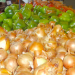
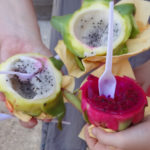
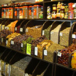
I love visiting the shuk in Petach Tikva. The huge mounds of fresh produce and bowls of spices are beautiful. During this trip I tasted dragon fruit for the first time. Would the dragon fruit have been as sweet if it did not have the visual appeal? I am certain that the colors of the dragon fruit and the produce and spices in the shuk will provide inspiration for future paintings and graphic design projects.
I am very excited about the blog post for next week. It was written by a guest, Israeli designer, Tzippy Lankin. Tzippy discusses using her design skills on music CD covers to form a visual bridge between music with ancient texts and the contemporary music market.


I was thinking something along these lines when I looked out the window yesterday at the vegetable stand across the street. They have giant bins lined up in contrasting colors – dark purple eggplant, orange tomatoes, bold green cucumbers, red peppers, and yellow peppers.