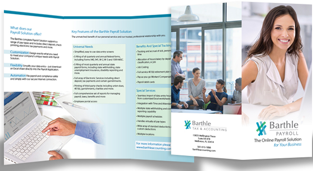
 I recently completed an interesting logo design and rebranding project for a client with whom I have been working since 2005. Over those 20 years, I had considered asking about making some improvements to the branding, because the logo had been difficult to work with at times. The opportunity arose this year when Eileen Barthle, owner of Barthle and Associates, approached me with plans to expand certain areas of her accounting practice such as payroll services.
I love the creativity involved in logo design and branding projects. I thought that I’d share a very simplified step by step process about how a typical logo design project proceeds.
- I create a logo “taste test” for the client. The taste test guages the client’s reaction to a group of logo images from within their business field and from outside their business field.
- Based on the client’s visual preferences, I begin work on a logo image.
- The first design presentation generally consists of 5-8 concepts. That means that I’ve probably generated at least 40 designs, pared them down and refined them to the 5-8 that the client is shown. The client and I discuss the concepts. Our goal is to identify one or two of the concepts or elements from several that will be refined and developed further.
- After more design work, I present the client with refined concepts. We’ll discuss and narrow down the selection.
- We’ll have another round of adjustment to the logo artwork and then I will create the final logo files.
- Logo files are presented to the client in formats such as pdf, eps, jpeg and png with a one or two page logo usage guide.
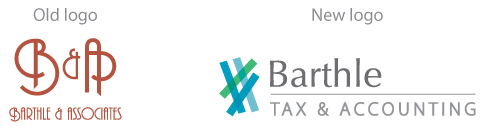
During initial discussions with Eileen, we agreed that a minimum of text was best. Included in the new logo designs are the more descriptive words, “Tax and Accounting” and a second variation with “Payroll” instead of “and Associates.” After executing step one above, I elected to handle the design process by going in two directions and letting Eileen choose which was best for her business. One set of logo design concepts for Barthle and Associates involved forming a visual bridge between the existing design and a newer one. I worked to maintain some elements of the existing art deco typography or the burnt red/brown corporate color. The idea behind retaining some of the existing elements was that it might provide a level of comfort to her established clients.
Once I had several very solid “bridge” logo design concepts to show Eileen Barthle, I asked myself, “If you could have Barthle and Associates use any logo design what would it look like?” I might never have presented Eileen with this additional set of logo designs. However, during the “taste test” phase of the project, Eileen identified a clean simple style with rounded letters in blue and green colors as her favorite. I went directly to this color family and worked with symbols (the octothorpe) that were tied to working with numbers, money and financial reporting.
Eileen was drawn to the newer designs and decided that it was unimportant to have a visual bridge between her previous brand. We rebranded all of the Barthle Tax and Accounting and newer Barthle Payroll communications print and web items with the fresh new look. Eileen Barthle has told me that the fresh brand image has received very positive feedback from both clients and colleagues.
Recent Comments