I’ve always had a strong interest in color. My final thesis paper in college dealt with the relationship between color and consumer choices. While working on the paper, my professor, the chairman of the Syracuse University Industrial Design Department, Arthur Pulos, invited me to work for him at his design consulting agency. I was tasked with choosing the proper color for a new model of stapler in the Ace/Swingline company line of products. My choices were less than thrilling. Offices were indulging in the beige-ing of America at the time. The available selection had to be somewhere between cream color and tan. My job was really to decide which of those subtle shades was least likely to look offensive with the office equipment of the day. Perhaps the decision would have been easier had Pantone begun to select their Color of the Year.
 Pantone has been selecting a Color of the Year since 2000. The Pantone company, is the world-renowned guru of color and of color systems that are used in technology for the selection and accurate communication across a variety of industries. The Pantone Matching System (PMS) is known worldwide as the standard language for color communication from designer to printer, manufacturer or retailer to customer. TheColor of the Year choices influence fashion, interior design, industrial design and ultimately advertising.
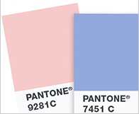
This year, 2016, for the first time Pantone chose two colors of the year, Rose Quartz and Serenity. The choices, a very soft blue and pink really puzzled me. I decided to research the circumstances and milieu that lead to this decision.
“Joined together, Rose Quartz and Serenity demonstrate an inherent balance between a warmer embracing rose tone and the cooler tranquil blue, reflecting connection and wellness as well as a soothing sense of order and peace.” stated Leatrice Eiseman, Executive Director, Pantone Color Institute.
Please read the full article on The Rickie Report, “A Behind The Scenes Look At The New PANTONE® Colors”.


Recent Comments