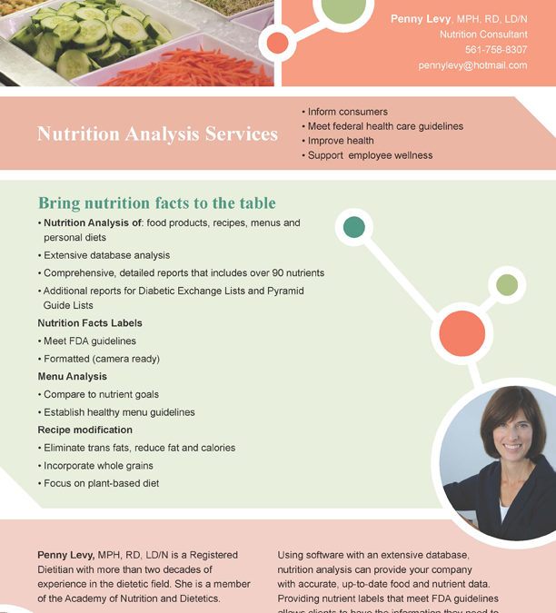
A favorite design challenge of mine is the one-pager. It is an opportunity to define what a business or organization is all about in a restricted space. A well laid out, uncluttered approach is always best. Large photos, headers and areas of white space assist the reader in absorbing the information.
I recently had the opportunity to work with a close friend, Penny Levy, to produce a one pager for her nutrition analysis practice. The elements with which we worked were a salad bar photo, contact information, molecular symbols, list of services, portrait photo, certifications and work statement.
What do you think of our results? If you are working on a one page design and would like a critique please I would be happy to offer suggestions. contact me and I’ll tell you how to send me the file.


Trackbacks/Pingbacks