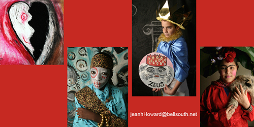
I recently worked with an enormously talented arts-education integration specialist and photo-journalist, Jean Hart Howard. She asked if I could add some interest to her resume. The resume was robust. It was filled with lists and descriptions of Jean’s credentials, experience, exhibits and awards. However, the text heavy resume prevented the reader from grasping her high level of creative energy and expertise.
We worked together to select photos from her arts integration teaching classes to create a grid in the center of the resume that showed the work of her students. Text was edited and headings were bolded and colored to match elements from the featured artworks.
Visual elements add more interest and “personality” to a resume or one page business information sheet.
Below are a couple of links to previously published articles about this topic:
- on my blog: http://carenhackman.com/?s=resume
- A very comprehensive article that I wrote for The Rickie Report: http://www.therickiereport.com/2012/09/20/caren-hackman-shares-resume-building-tips-for-creative-professionals/


Recent Comments