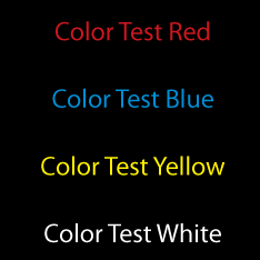
Testing red, blue, yellow and white lettering on a black background.
Happy new year.
To start off 2013 , I’d like to offer simple tips to assist in the reading of all visual communications material. This first column will discuss color and contrast.
Black backgrounds can be stunningly beautiful, classy and striking. However they can also act against the reader. Care must be taken to insure that the black background does not have the effect of swallowing up lighter colored type. When placing art, especially a logo make certain that there is adequate contrast between the black background and the type or art. Please take a look at the “Color Test” examples. Stand back from your display and test which colors read best on black.

White type on a black background has been resized to ease eye strain.
When I place light colored type on a dark background I often make small modifications to the type. The example shows how the majority of the brochure layout is in Myriad Pro light, 10 pts with the leading (space between the lines) set to 13 pts. When I placed this text on the black background it became more difficult to read. To ease eye strain and increase comprehension, the text that is placed on the black background was increased to 11 points. The stroke weight was increased to “regular” and the leading to 15 pts.
Pin It

Recent Comments