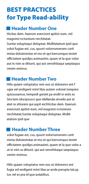
Making Text more Readable: This illustration uses 11 point type for the main text. The header at the top is 21 point bold. The section headers are 16 points. Space or leading in between all lines of test is 16 points.
As interesting as your subject matter might be to you, it may not immediately engage the reader. The previous blog post I demonstrated some techniques to assist in making type easier to read on a a dark back ground. Today I am offering three suggestions for making certain that large blocks of type are easy to read.
Subtitles and section dividers
Dividing a large expanse of type into sections with subtitles offers readers an easy way to locate information of greatest interest. It also offers a resting place for the eyes in between each section.
Narrowing the width of the lines of type
Wide expanses of unbroken text fatigue the eyes and can cause the reader to loose his or her place, not to mention becoming bored.
Increasing the space between each line of type
This little trick not only assists in ease of reading but offers a more sophisticated look to the entire block of text.
Pin It
Recent Comments