
In my previous blog article, I described some principles of good visual communication. I discussed the roll that good graphic design plays in effective visual communication. Design concepts and principles are ageless, while the need to become more proficient in using them with today’s media is ever increasing. This article will focus on design principles that make print and web projects easier on the eyes.
The article also will show examples of consistent messaging (i.e.,links) and common nomenclature. Below are two BEFORE examples, where I’ll ask you to guess what needs to be improved, and the AFTER examples with my suggested improvements.
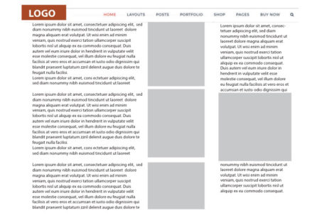
BEFORE 1 WebPage
While nothing is dramatically wrong with this web page example, there are ways in which the information could be presented that would make reading easier.
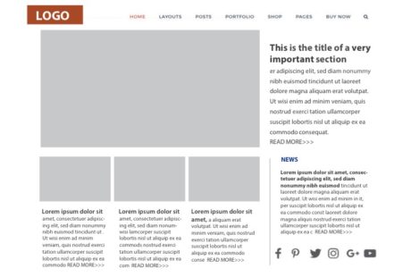
AFTER 1 Web Page
The “AFTER” example is more enticing to view and easier on the eyes. The page features a large photo with accompanying type that is larger with expanded line spacing. This lets us know that the article is the “feature” or most important one on the page. Three other articles are situated below this feature. All the articles have beginning excerpts with “READ MORE >>>” links to the entire article. This strategy helps the visitor to browse the web page and locate the article for which they are searching.
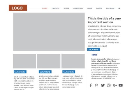
BEFORE 2
The BEFORE 2 example has links placed in various colors and in varying locations. Link and button colors, styles and locations on a website should be as consistent as possible.
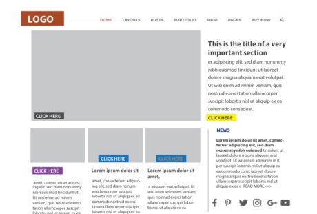
AFTER 2
AFTER 2
The AFTER 2 picture displays consistent styles for the links. Fortunately, many web design themes available for use with WordPress, WIX, SquareSpace and other providers and platforms have styles built into the themes that offer a choice of visually consistent links and buttons.
Nomenclature and Symbols
While making an effort to be creative or distinguish themselves as different, some individuals and organizations inadvertently stymy their own mission. They use creative terms that might be relevant to only their industry or they incorporate ornate typestyles that are difficult to read. Using common nomenclature and symbols insures that site visitors will be able to easily access information and interact appropriately.
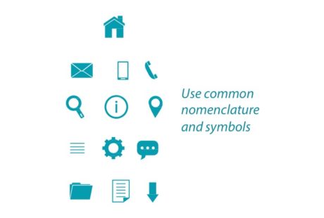 Positioning the home page button, search icon, and contact information, etc. in commonly used locations will prevent visitors from leaving the site out of frustration.
Call-to-Action
This tip also applies to print design. On many occasions I’ve received a hardcopy letter requesting that I take action such as call, donate, or visit. This call-to-action (CTA) and contact information are buried in a paragraph in the middle of the letter.
It is a good idea to carefully study other sites or print materials to determine best practices. Many of the themes and templates available for use have been created by experienced designers, and will steer you in the correct direction.
One last cautionary note. Offering multiple CTAs can be confusing and cause the reader to choose not to take any action.
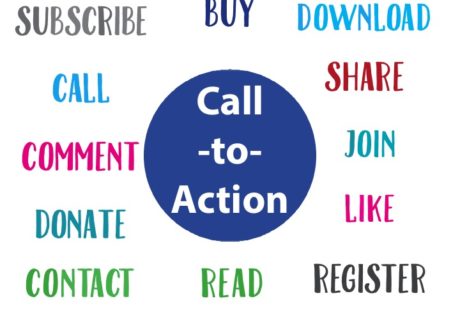 Choose a priority CTA to highlight and keep other options available, but in a non distracting format.
To summarize, both print and web design benefit from consistent, common use of communication elements.
Pin It
Recent Comments