What is good communication design?
Since my book, Graphic Design Exposed, was published in 2012, I’ve been asked to speak to a variety of organizations. I discuss the roll that good graphic design plays in effective visual communication. Design concepts and principles are ageless, while the need to become more proficient in using them with today’s media is ever increasing.
In this blog’s next group of articles, I’ll be explaining some of the principles of good graphic design and give examples of ways to focus on the audience, improve the message, and correct common mistakes.
It’s true that professionals have training and very substantial software available to them; however, everyone has the opportunity to develop and use good visual communication skills.
Graphic design is an applied art. Visual creativity is used to solve a problem or achieve certain objectives, with the use of images, symbols and words. It is a partnering of visual communication and aesthetic expression.
Starting a project with the 5 W’s
Before any design work begins, plan carefully by asking the five “W’s”;
Who, what, where, when and why. Make your own list for every project launch. Ask questions such as:
- Who is our target audience or market? Who are we (clearly identify yourself or your organization)?
- What kind of media will be used to carry the message? What is the primary call-to-action? What kind of results do we expect? Where is our target market?
- Where can we best reach members of the target audience?
- When should we go live or send out our communications media? When should we expect responses to our message? If having an event, when is it, where is it? Why are we communicating?
- Why is our message important? Why should our audience care?
Continue asking questions throughout the design process. Who should have the final word on proofreading? What software will be used to create the communication piece? Where can we make changes to clarify the message and draw attention to the call-to-action? When will we decide that revisions are complete? Why am I using this font, color, photo, etc.?
I am a believer in paring down a message to its most essential elements in order to avoid visual confusion and make certain that the true meaning is conveyed. Following are two of my favorite quotes.
If you can’t explain it simply, you don’t understand it well enough.
— Albert Einstein
“Simplicity is the ultimate sophistication”
— Steve Jobs
Project Example #1 Do’s and Don’t’s
Following is an example of a graphic design piece created at its inception (Before) and the final piece after the design process (After). Please take a look at the “Before” example and try your best to list the components that need correcting before peeking at the “After” or finished design that follows it.
BEFORE design inception
By comparing the two designs we can see the differences and pick up some design tips.

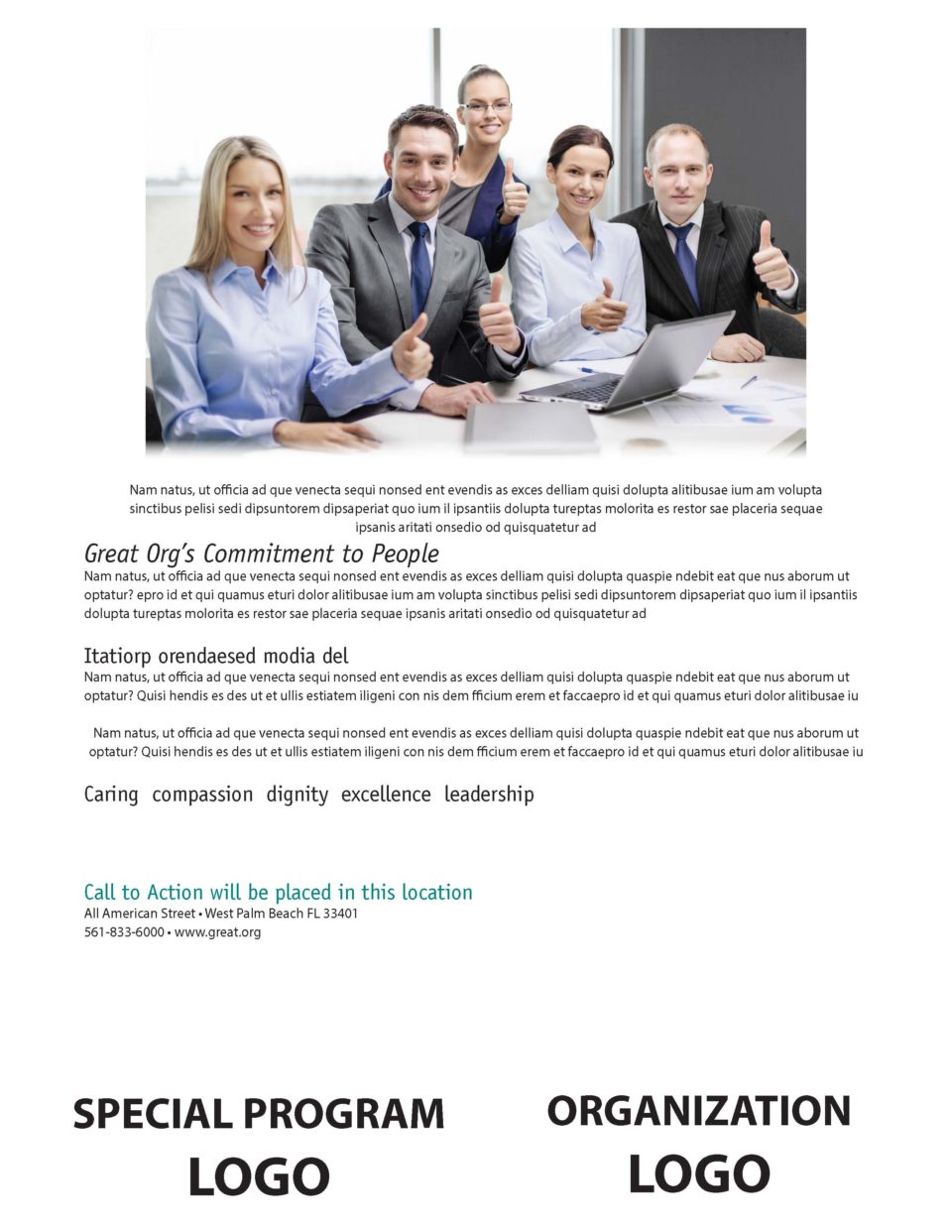
AFTER Finished design
The subject of the communication piece is a special program that the organization is promoting. I’ve placed it at the top left so that it is the first item that readers see it as they begin to read.
The width of the text column is much narrower than on the original. Forcing the eye to read paragraphs of text that are excessively wide causes eyestrain. A general rule is that 50 to 80 characters per line (cpl) is comfortable. Ease of reading depends upon many factors such as the background and text contrast, font characteristics, text size, and tracking (distance between letters), and leading (distance between lines).
The photo of the people has been enlarged from the original. A picture can tell 1,000 words. Photos with people attract viewers and draw readers into the message.
It has become commonplace for a call-to-action, organization identification and contact information to be located in the header or the footer, as you see here, of communications pieces and websites. For those of us who feel a need to be original, keep in mind that you only have moments to attract a reader and communicate a message. By sticking with conventional formats the message has a better chance of being conveyed because the reader knows where to find items such as a call to action and contact information.
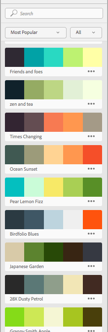
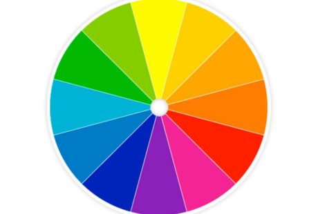 Notice please, the colors that are being used in the design. If you don’t know a great deal about color theory use the following rule: Create a color palette with several analogous colors and a neutral. Analogous colors are those that reside close together on the color wheel. Together they create harmony and permit the message to shine through.
Design fundamentals are important and can take you a long way in communicating a message effectively. Please comment on this article in the space provided. I am happy to answer questions.
Recent Comments